What TWO conventions have i used & why?
1: I have used a famous footballer on the front cover because he would attract female attention furthermore, he is very wealthy. Also this footballer is a model so he does fit in with this type of act.
Also, he is looking straight at the camera with the caption ' Gomez gets girls' This is to show girls who don't know who he is that he is quite popular. He is the main celebrity on the cover. To show how popular Gomez is he is on the front
2 I have used a mix of pink, blue and white with the title in a bold purple i have used different fonts on the title and the stories. I have used a different font for the pink colour in contrast to the blue colour. My cover is asymmetrical because the main headlines are on the more busy side.
3 I have not made my cover symmetrical which could be a problem because the audience could look at the busy side when a headline that they would like could be on the other side. This would mean I would loose a customer. Furthermore I could have put a shaded back ground on each of my headlines to make them stand out more catching the attention of the reader.
Monday 10 March 2014
Sunday 2 March 2014
coursework lol
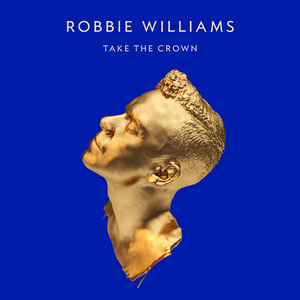 The connotation of this album are a picture of a golden statue of Robbie Williams. There is also his name and the name under the album. This golden statue suggests that he is very wealthy and that he is going to make a lot of money about this album.
 The connotation of this album is a picture of Jason with a chequered shirt, tie and blazer he is also wearing a top hat. This means that he is sophisticated but the chequered shirt makes him look slightly casual
 The connotation of this album is a picture of a bulldog. This could symbolise hearty British music. The yellow writing means that this band stands out and is different to any other band.
 The connotation means the black on black means this band is discreet and are not a flash band. The no picture means that the band doesn't need a special album cover to sell. The album already world known.
 This album cover is grey with a bright letters. This cover doesn't have the bands name which could mean that the band are so famous that they don't need to put their name. The special detail could mean a small source can produce big produce
GREEN
Really good piece of work with the right amount of detail and analysis. Well Done.
Balance lol


This magazine is not symmetrical but the photo is symmetrical. All the writing is on the left side and the celebrity/models name is on the right side. To try and make the magazine cover balance she is facing the right side.

This is radial balance because it has the person in the middle with all the headlines and story's around the outside. The stories are in a ring shape around the picture in the middle.


GREEN
Really good piece of work with the right amount of detail and analysis. Well Done.
Subscribe to:
Posts (Atom)